In this blog post I’m going to talk about what to put in the top third of your website homepage and why it shouldn’t be a quote from Marie Forleo, Tony Robbins, Seth Godin, the Dalai Lama or any other folk that inspire you.
If you’d like help making sure that your website tells your story, connects with your ideal audience and gets them to take the action you want, come find me on LinkedIn
Your website design should work with your copy and images to tell the story of your business, show your clients how you can help them and inspire them to take the action you want them to take towards a sale or working with you.
The top third of your homepage, also known as the header, hero section or above the fold (from the days of broadsheet newspapers) is prime real estate on the internet.
It is the area that people see first before they have to scroll and with visitors deciding if they’re going to hang around on your site within seconds, it really is worth being thoughtful about what you put in this area.
I was recently doing a website audit with a client who was a coach. She was super clear on who her audience was and how she could help them and we were reviewing her site to ensure that her copy communicated clearly what she did and who she helped.
The very first thing I spotted on her homepage was her header banner – a beautiful image of her standing out in nature. Great start.
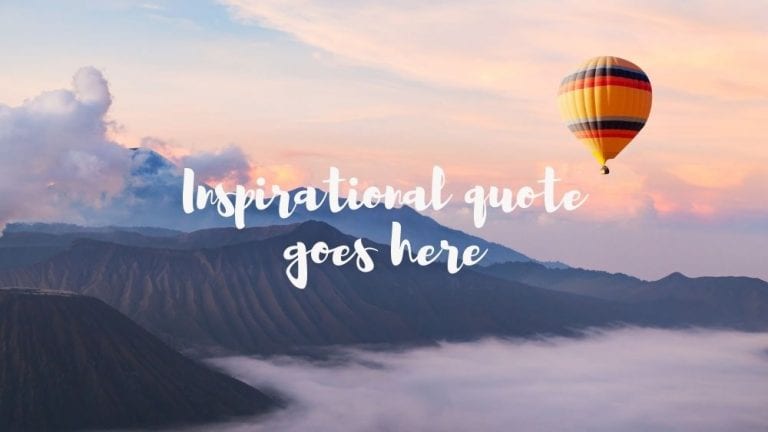
But the image had a text overlay which was a quote from Marie Forleo.
Now, I love an inspirational quote as much as the next person, unless that person is my friend Claire who thinks they’re a pile of poop, but anyway. I love a quote and they have a place, but that place ISNT THE TOP OF YOUR HOMEPAGE!
Marie Forleo doesn’t need your help!
Why would you use the most valuable real estate on your website to promote someone else’s business instead of promoting yours?
The header area of your homepage should promote your business and include a call to action that prompts people to take the most important action to move their relationship with your business forward.
Ideas for what to put in the above the fold section of your website
The homepage of your website should communicate the following things;
- What makes you special
- That your customers are in the right place
- That you have what they need
- That you are the right person or business to help them
- The next step your customers should take
Ideally, this all has to be communicated in the top third of your website.
It seems like a tough job, but if you’re clear on your business values, your ideal customer and your offer it becomes much easier.
The hero section or header banner should focus on a simple call to action which is the most important thing you want customers to do today.
For an e-commerce site this might be a sales banner leading to a seasonal product collection, for a consultant it might be a contact form or free download, for a SAAS company it could be a free trial.
That call to action should be the first step your customer takes towards a sale. Save the inspirational quotes for further down the page or your social media stream.
So the simple answer to the question; “What should I put at the top of my website is”
Think about what’s the most important thing you want your customers to do, and that goes at the top of your website.
If any of this sounds familiar to you and you’re looking at your website thinking “uhoh!” I can help. Come find me on LinkedIn and let’s talk through how I can help.


